Here is my painting of a little sparrow to commemorate the event!
|
I've just learned that today, April 8th, is Draw a Picture of a Bird Day! This is an annual event so I hope to post something every year!
Here is my painting of a little sparrow to commemorate the event!
0 Comments
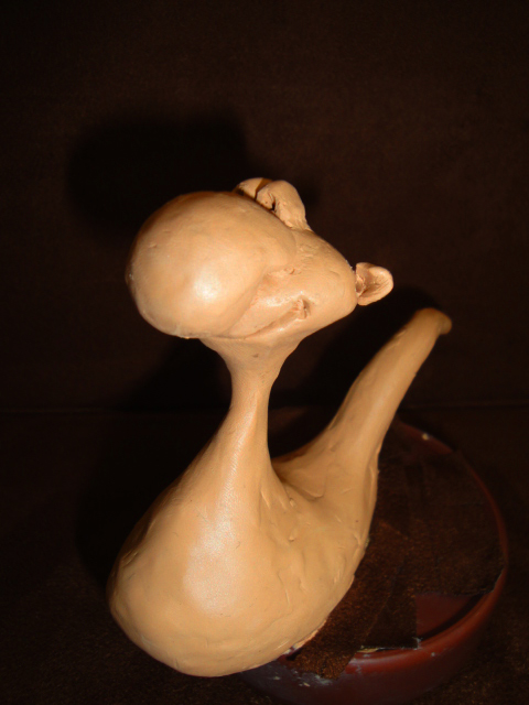
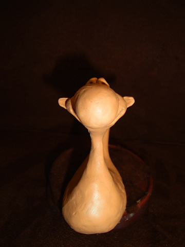
I just wanted to wish all my friends a very Happy Easter and a joyful Passover! 
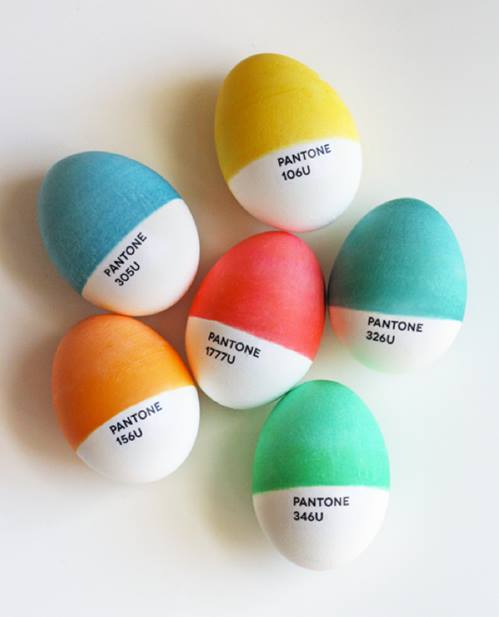
I think every artist illustrator has had to match Pantone Colors at one time or another!! So I really loved this image of Pantone Easter Eggs. Such fun, and so creative. 
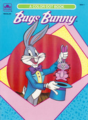
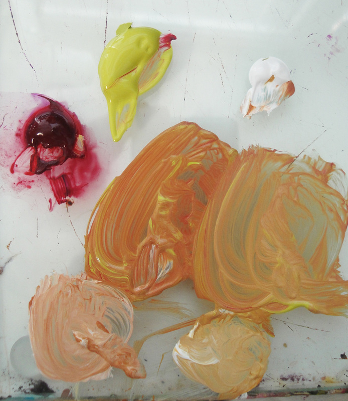
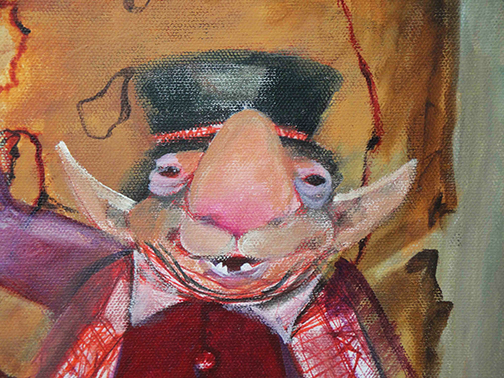
I remember purchasing my first Pantone guides to match Bugs Bunny's standardized colors. This was a coloring book assignment for Golden Books. I was given the Pantone numbers, and I had to match them to the pink in his ears and mouth, the grey of his fur, blue of his jacket etc. At the time, an interesting and new challenge for me. I've always been inspired by Maxfield Parrish's complimentary colors. He's one of my favorite artists. So I decided to use that same combination in my garden. I'd started with a planting of Orange Clockwork flowers. I liked it, they were beautiful by themselves, but I decided to add a complimentary Blue Morning Glory to make the planting more vibrant. Now I love it! Here are three examples of Maxfield Parrish's work using cool backgrounds, and warm toned figures or details in the foreground. They are so amazing. Makes me want to paint, in the studio, or outside in the garden!
Below is the wall next to my computer desk. It's decorative, but utilitarian. The white framed boxes, underneath the Create sign, open to hold reference or items of inspiration. I can easily change them out whenever I want. Inside the boxes I've included words of inspiration, ideas for stories, and of course a picture of camels. There is an owl's feather a friend found on a walk and gave to me. When I was in college my father and I had a jewelry business. We cut stones, ground cabochons, and cast settings in silver and gold using the lost wax technique. In the upper corner of the first box are the testing needles we used, along with a touchstone, to test the karat of gold samples. I also love the beach, and so I have seashells scattered all over my house, including over the top of my shadow boxes. I keep my drawing pencils, pens, and etc. organized in an antique sugar mold from Mexico. I love mixing rustic with modern, not to mention goofy with practical. I have good luck troll dolls my mother gave me, next to highlighter pens, next to a frog princess wand, and a dragon pen.
At the very end are crow feathers I've collected. I use them to paint marble veining and other textures. Everything is handy, useful, or inspiring. I think you have to surround yourself with things you love or that give happy memories. They all help you to be creative. It's been awhile since I mentioned a fantasy project I've been working on. Part of the reason is it's a personal project, and I'm working on it between assignments. The other reason is, I'm also writing a lot and that takes up quite a bit of time!
Here is a detail of my painting in progress. I'm working in acrylics on canvas using a mostly greyed palette, which is something new for me. I've also started working with several Jo Sonja colors, especially the Vintage Collection. I also use a mostly dry brush technique. Maxine's Mops are the brushes I use for my figures and portraits. I'm having fun painting this project, as well as sketching out ideas for other pieces in the series. I hope to finish it soon so I can reveal the entire canvas! I have a new fantasy series in progress and I will put up some of the art once I have a few completed. In the meantime, I thought I would post this picture of the project that Peanut and Cashew Nut have been working on.... gopher hunting. Or, maybe I should say on gopher watching! It's the highlight of their day. I have to add that together they dig bigger holes than the gopher! Originally this hole was too small to accommodate two intrepid "hunters", so they enlarged it by ten times at least. Between the gopher, and my Nuts, this part of the yard has quickly become a plant free zone!
I was going through my memory files and found this thank you note from Ray Bradbury regarding a painting I'd done. The art illustrated a quote RB wrote for the Thousand Oaks Library. His note still makes me happy! In the artwork I incorporated a family photo of Ray at three years old, placing the planet mars in his hand, and his feet in the clouds. He subsequently requested and used the image for personal use, and had the painting hanging behind the desk in his office. I never missed one of his talks at the library! He was always inspiring. He never graduated from college but he said the library was his university! Brilliant man. I'm working on a new picture book concept which includes a passle of goofy "monsters". I've been sketching lots of characters and I decided on this one to start with. From the sketch I sculpted a maquette, a small preliminary model to use for lighting and positioning. I used Sculpey III polymer clay, with an interior wire armature. Here is the rough result. I don't need to make the sculpture perfect since it's just a basic reference. I'll be painting all the details and tweaking the silly "monster" when I put the final character on canvas with acrylic paints.
Over at THE ILLUSTRATOR'S TABLE, on the Table Talk blog, there is a discussion about the new Inkling from Wacom. I wasn't so sure about it before, but the more I look into it, the better it looks, especially if you do a lot of sketching on site or away from your computer. I've watched several YouTube videos and they all have tips and instructions on using the product. I've included one on this post that has some good beginner info. I'd love to try one and probably buy one! I do love my handy gadgets! I've been using a strange paint combo to create a base flesh color, Alizarin Crimson and Spring Green! ( I'm using Liquitex Alizarin Crimson Hue, and Jo Sonja's Tree Frog Green) You'd never think in a million years that these two colors would make such a wonderful skin color but I love it! The ratio I use is about two-thirds green to one-third crimson. That mixture can be seen on the left of my palette. The batch on the right has additional green added. Below, each batch I've added white to show how lovely the final color looks. He's just blocked in, but I'm using this basic flesh on the Poggle fantasy character I designed. Add Hunter's Green, or Dioxazine Purple to darken the base for shadows.
Give it a try! I think you'll like it! |
Mixed Nuts
A mix of everything art and writing. ARTWORK SLIDE SHOW Archives
June 2025
Categories
All
|

RSS Feed